Yanqing Wang: London Calling
2nd—1st May 2025
—
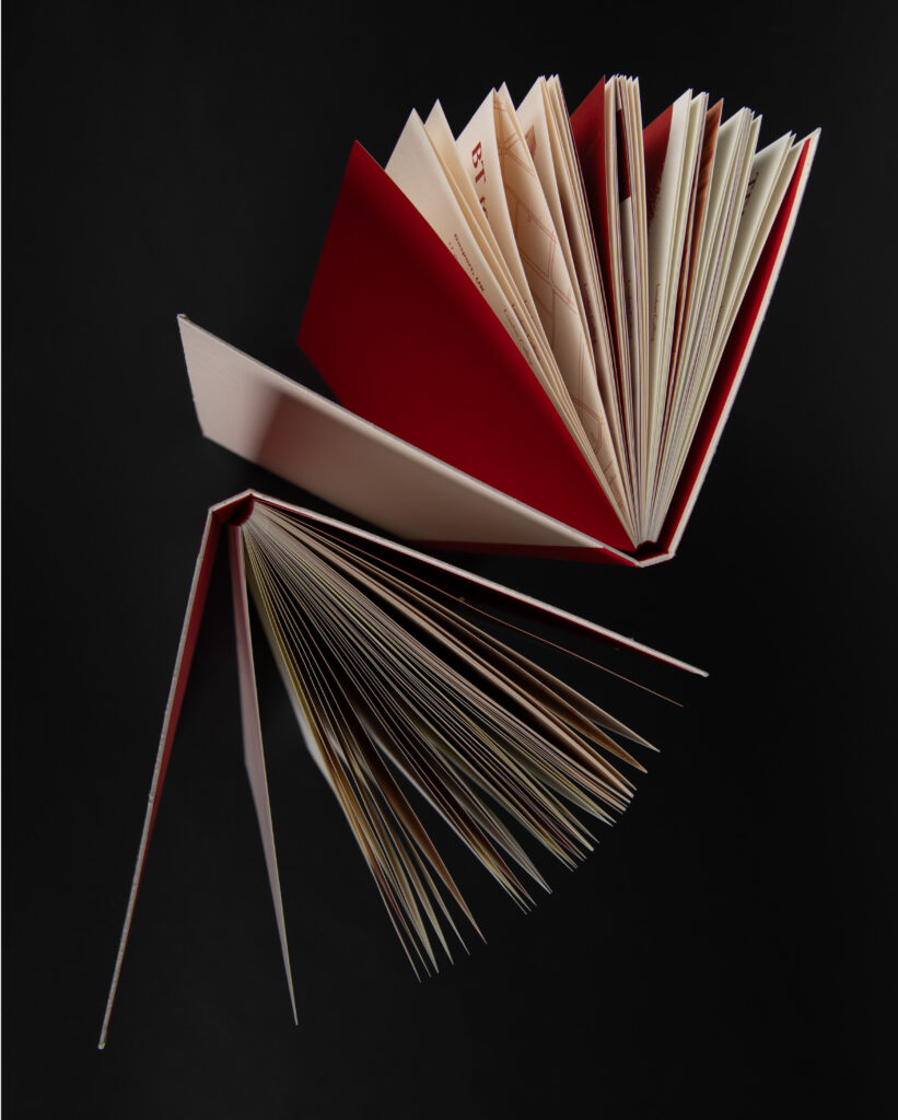
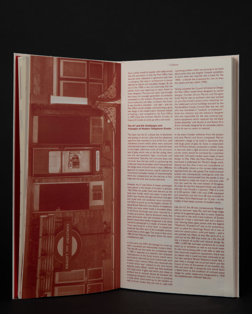
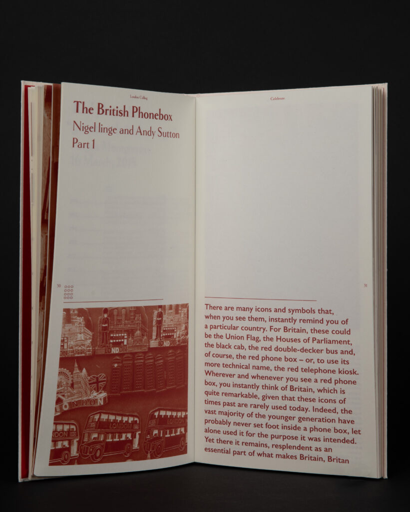
This book design project aims to document the history of the telephone kiosk from its inception to its decline. Designed by Sir Giles Gilbert Scott, the red telephone box has become a great symbol of Britain, with 39% of Britons considering it to be the greatest design in British history. However, with the popularity of mobile phones, phone booths are gradually disappearing from our lives, especially for the younger generation, and have become an unfamiliar presence.This project will focus on the glory and decline of this historic design, documenting its story.
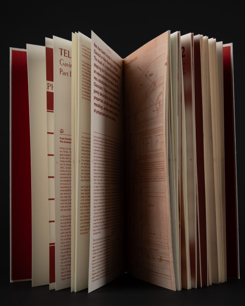
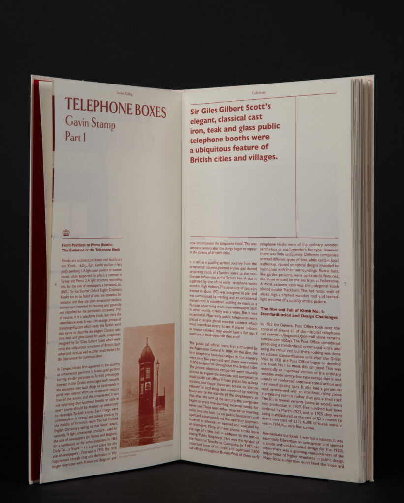
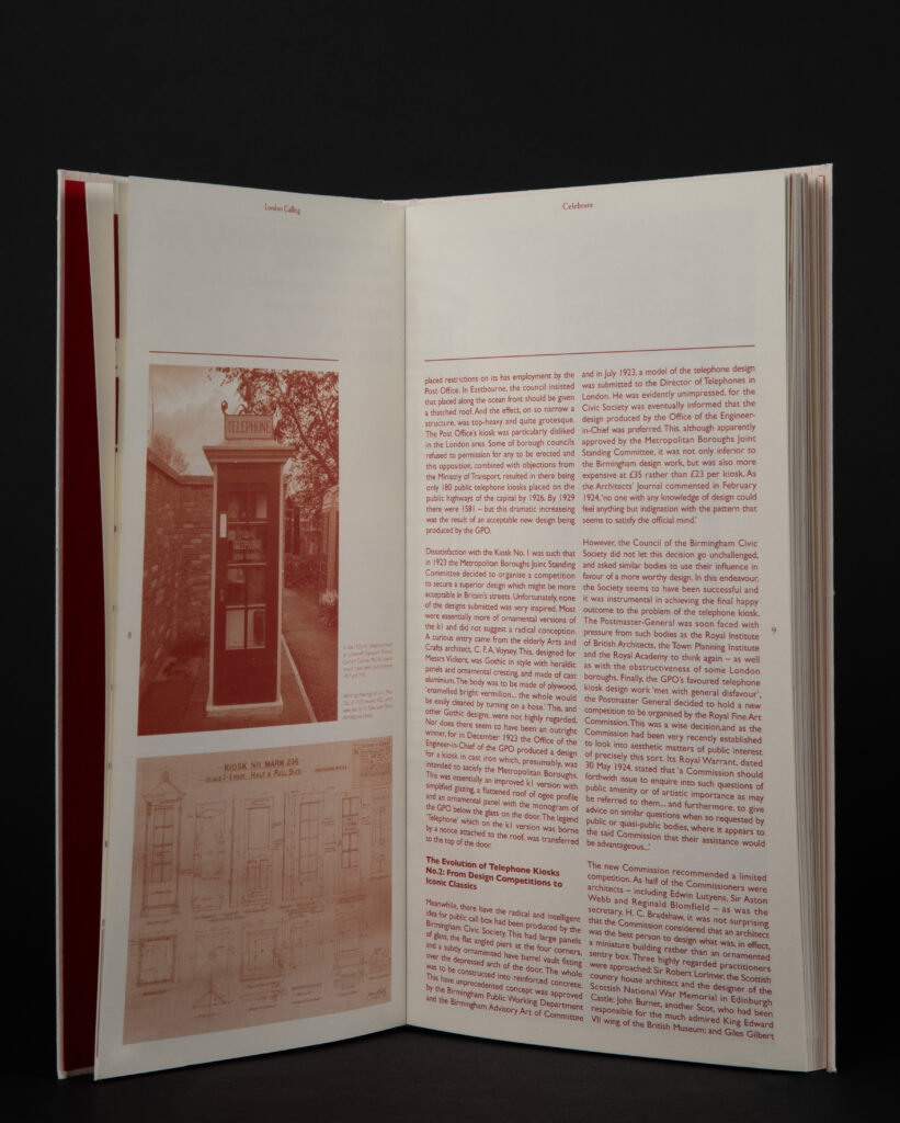
The publication is divided into two parts – ‘Celebration’ and ‘Decline’.The first half of the publication looks back over 80 years of the development of the telephone box, from K1 to KX100, and explores the public perception and use of public telephones in the UK.The second half details how the telephone kiosk has gradually gone into decline.The publication draws on a wide variety of textual sources, including books by authors, newspaper articles, news reports, public comment and my first-hand research photography and maps.
The overall design style draws on British modernism, with a soft and traditionally fused character. Modernism is a style from the 1920s onwards, the same time as the invention of the telephone booth. Modernism can now also be seen as an infamous movement, which coincides with the glory-to-decline of the telephone booth.The publication employs a dynamic grid system, which is moderately breached in the second half of the publication as the content shifts to a narrative of decline and the text layout becomes more free-flowing.A serif typeface was chosen for the headline, inspired by the word ‘TELEPHONE’ on a telephone box, and combined with a body text in the famous British Gill Sans typeface, it reflects the humanistic spirit of British modernism.The size of the pages is also inspired by the telephone booth, and the width of the pages has been adjusted to be slightly wider than the original proportions in order to improve the reading experience.
Scattered icons are used throughout the publication, reflecting the quirkiness and eccentricity that is unique to British culture. through these icons, the design mitigates the coldness and functionality of the modernist style to a certain extent, adding some British humour and reflecting the unique charm of British modernism.
International Society of Typographic Designers award winner.